Start a project
Spec project
DracoLabs
A spec identity for a strength-training apparel brand, built around one promise: gear that works as hard as you do.
- Project type
- Spec project
- For
- Self-initiated
- Role
- Strategy, identity, art direction
- Deliverables
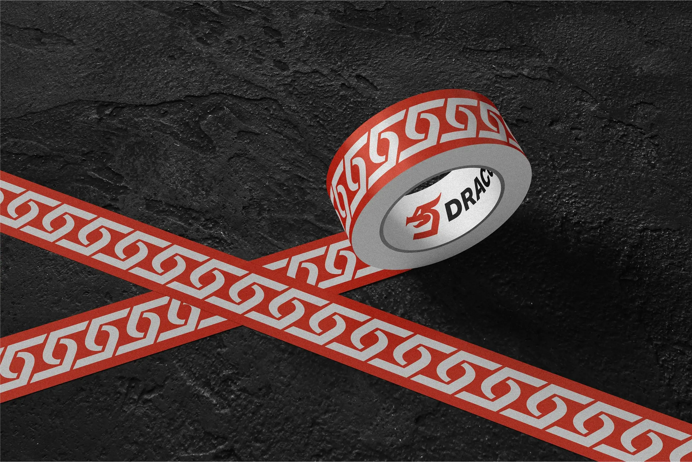
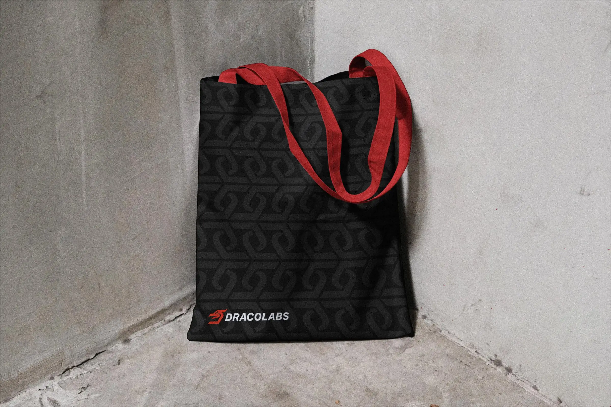
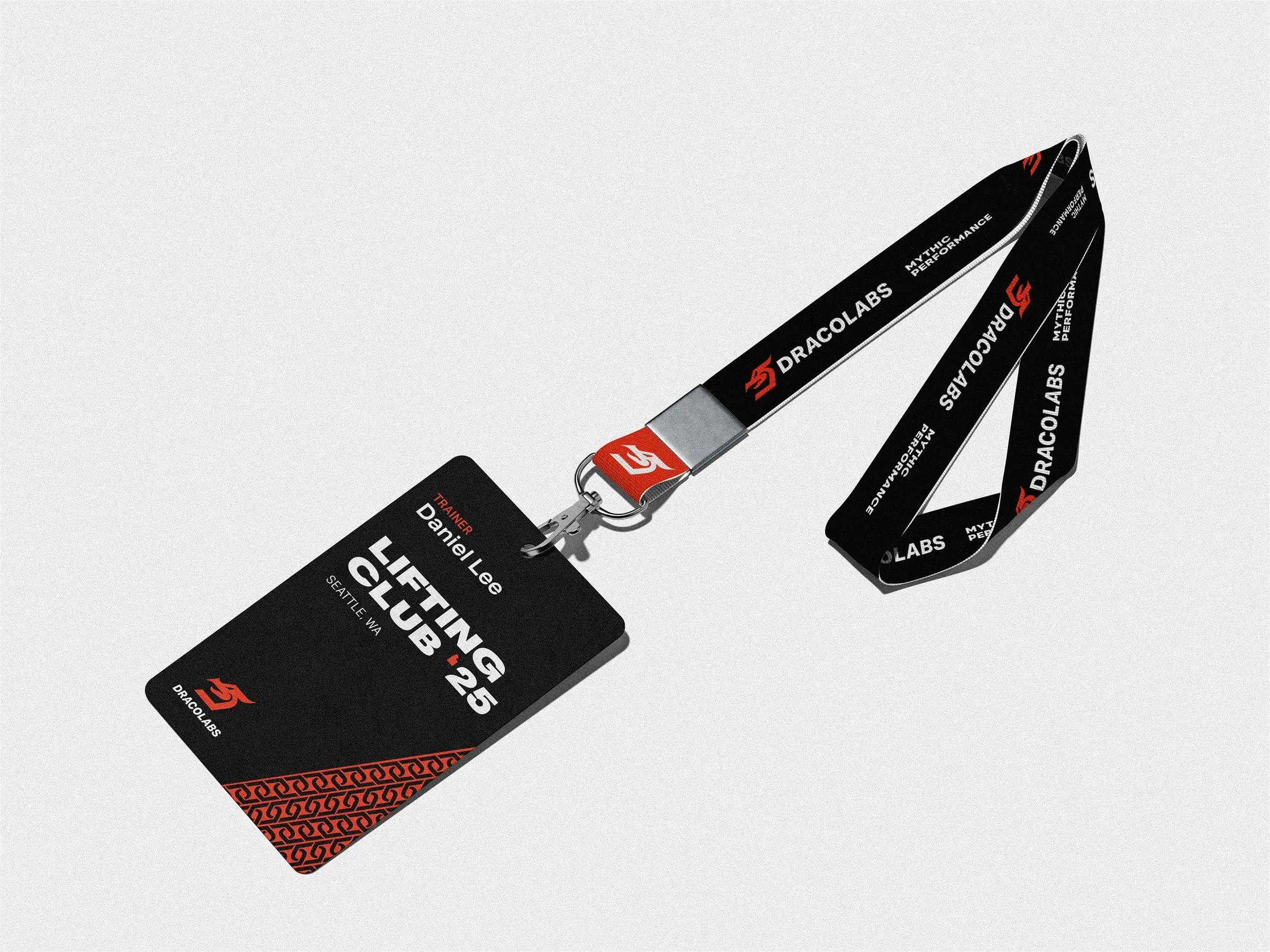
- Mark, type, apparel, packaging, out-of-home
- Year
- 2023

01 · The brief
Built for lifters, not influencers.
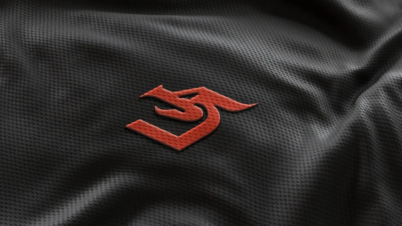
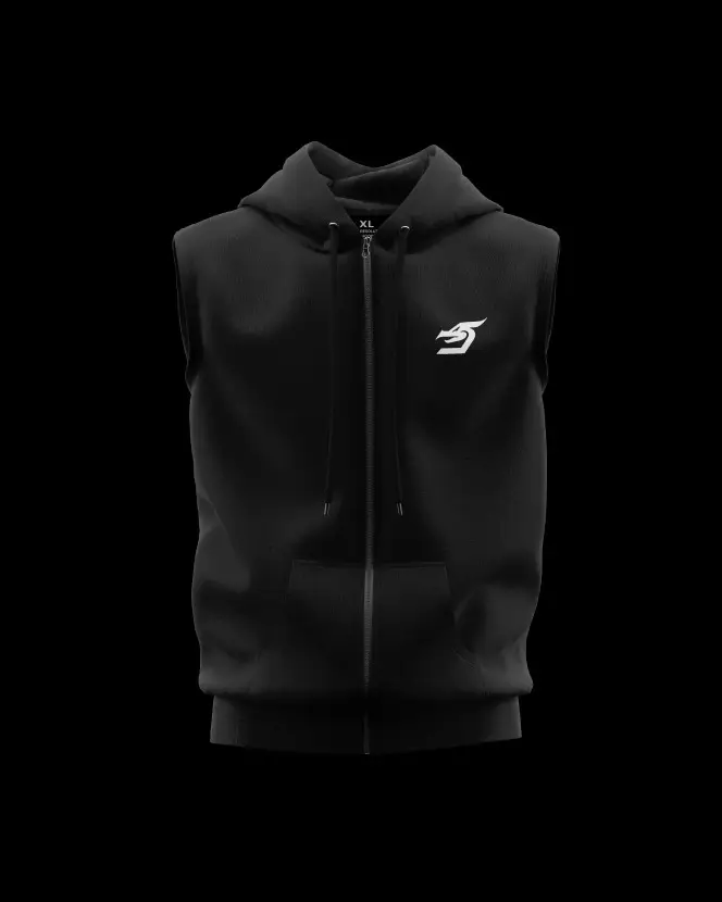
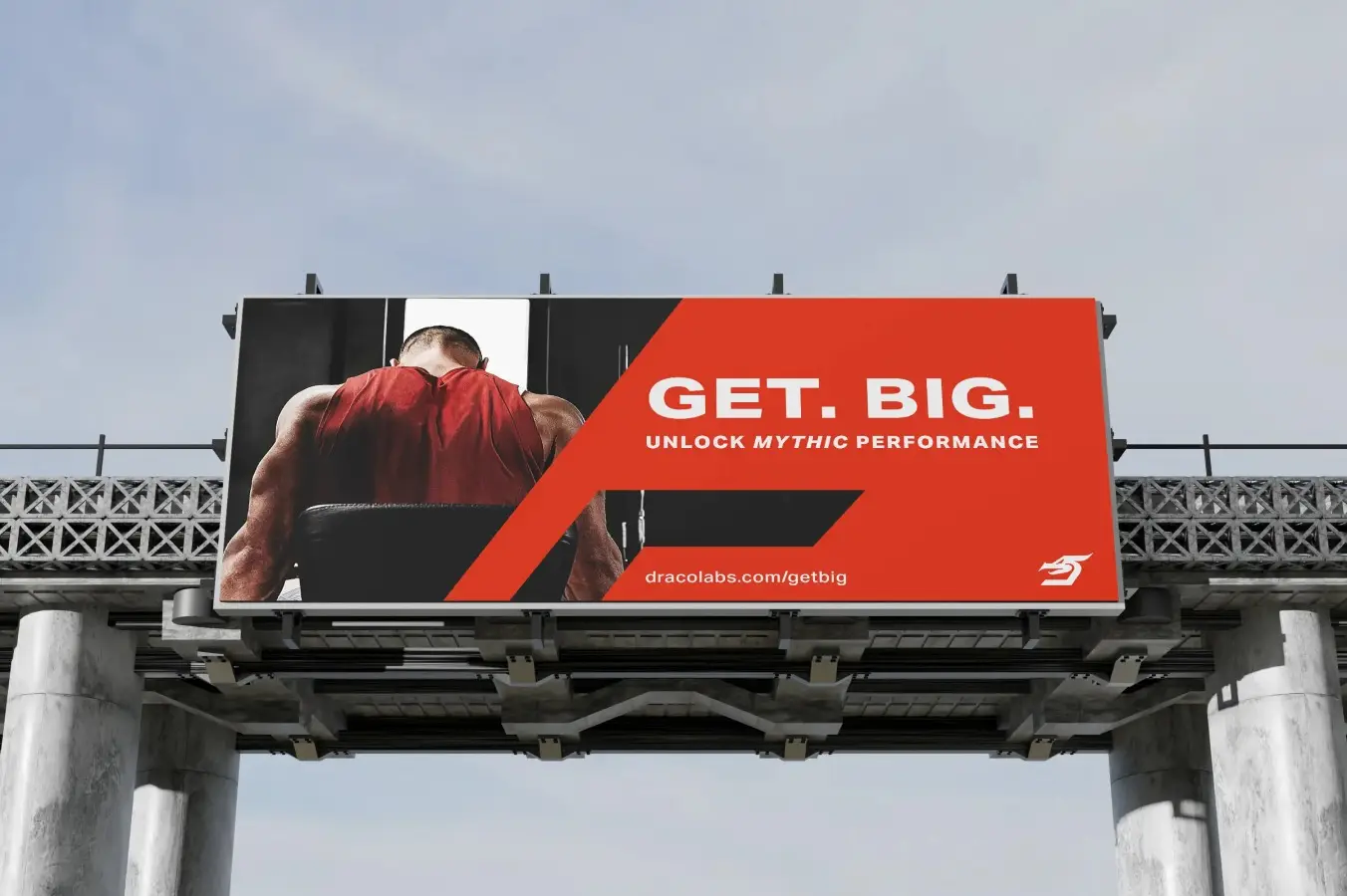
DracoLabs is a spec project. The question: what would a strength-training brand look like if it was made for the people actually under the bar? The mark had to hold up stitched on a shirt, printed on a tub and blown up on a billboard.
02 · The idea
A dragon, reduced to one gesture.
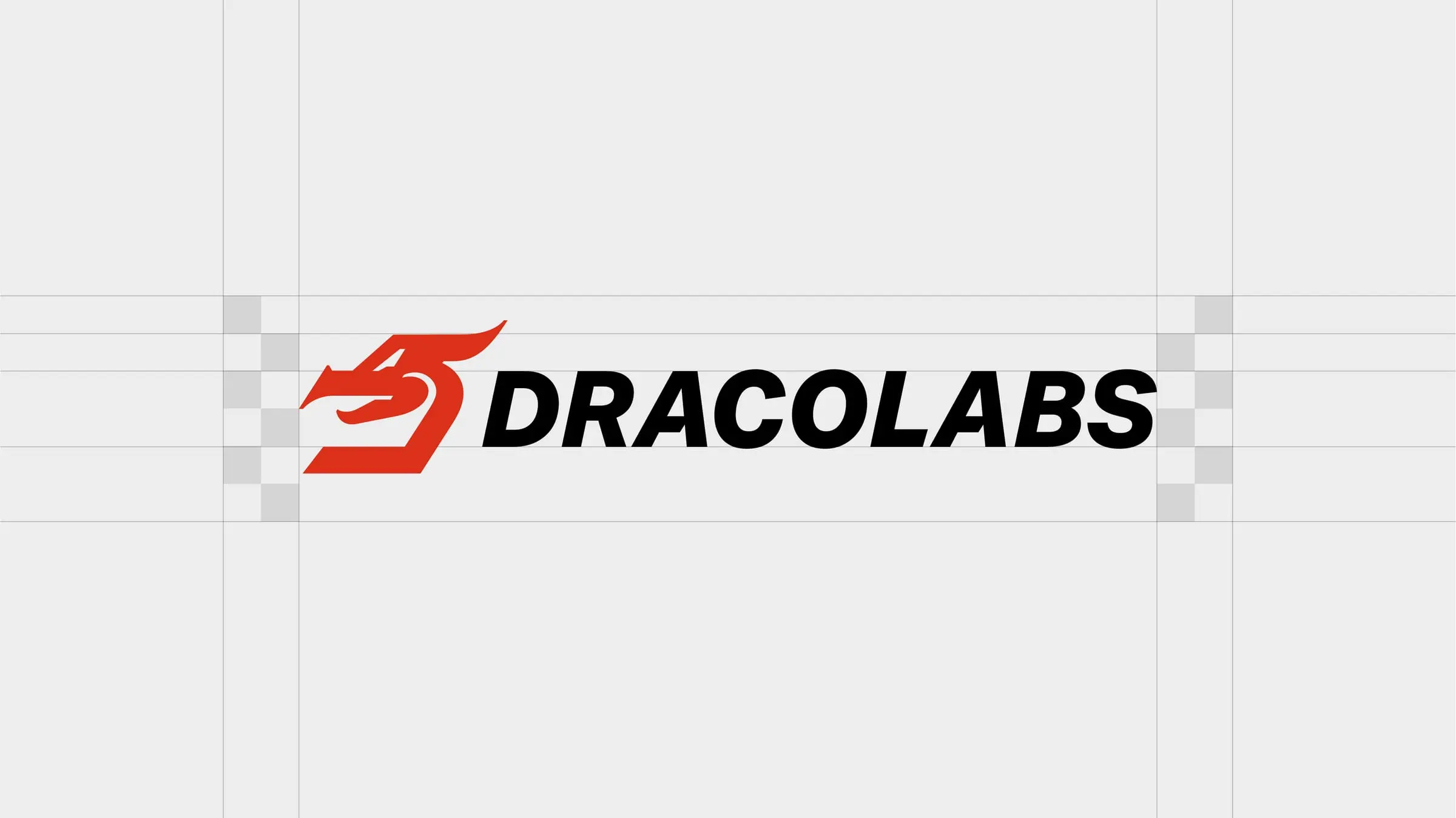
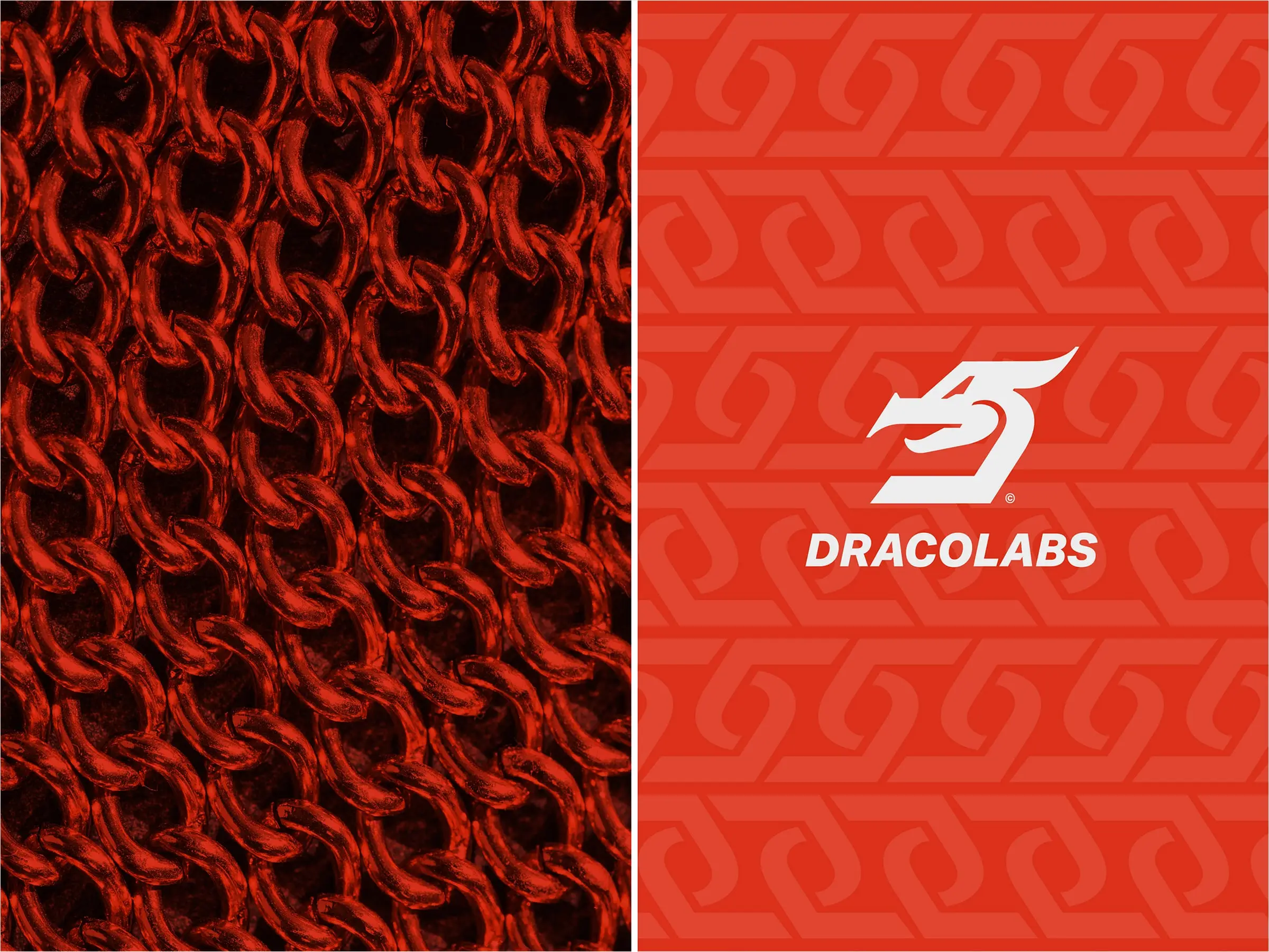
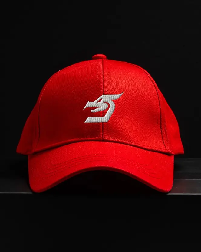
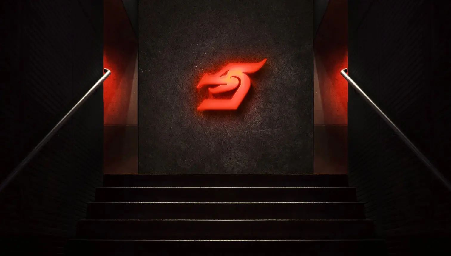
Draco is Latin for dragon. The mark strips the beast down to a single forward-leaning form, aggressive enough for the gym floor and simple enough to embroider small.
Brand manifesto
“DracoLabs isn’t just a fitness brand: it’s a movement. For those who refuse to settle, for those who push the boundaries and shatter expectations, we design gear that works as hard as you do.”
Brand copy written for the DracoLabs spec identity.

03 · The system
Red, black and nothing extra.
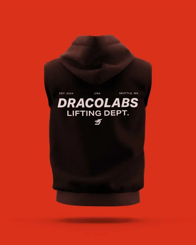
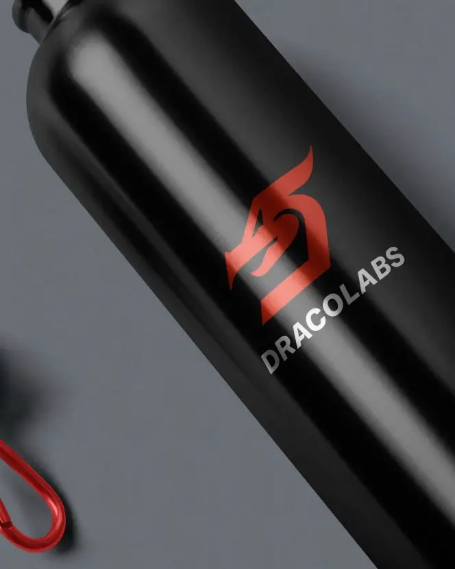
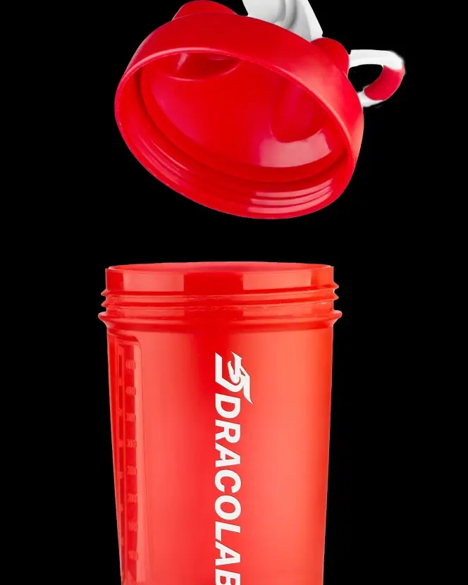
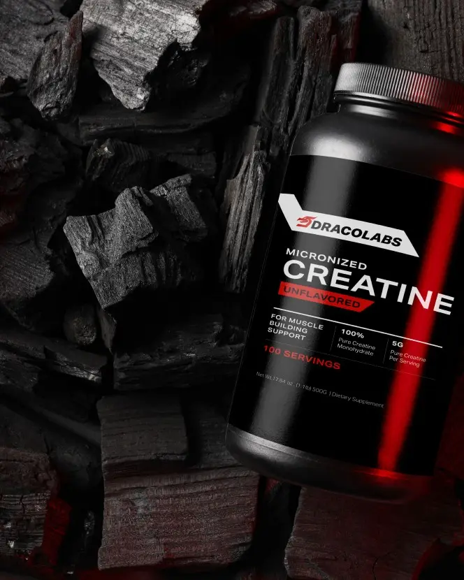
Two colours and one heavy italic carry everything from the hang tag to the creatine label. No gradients, nothing that can’t be screen-printed or read from across the gym.

04 · The process
From sketch to grid.
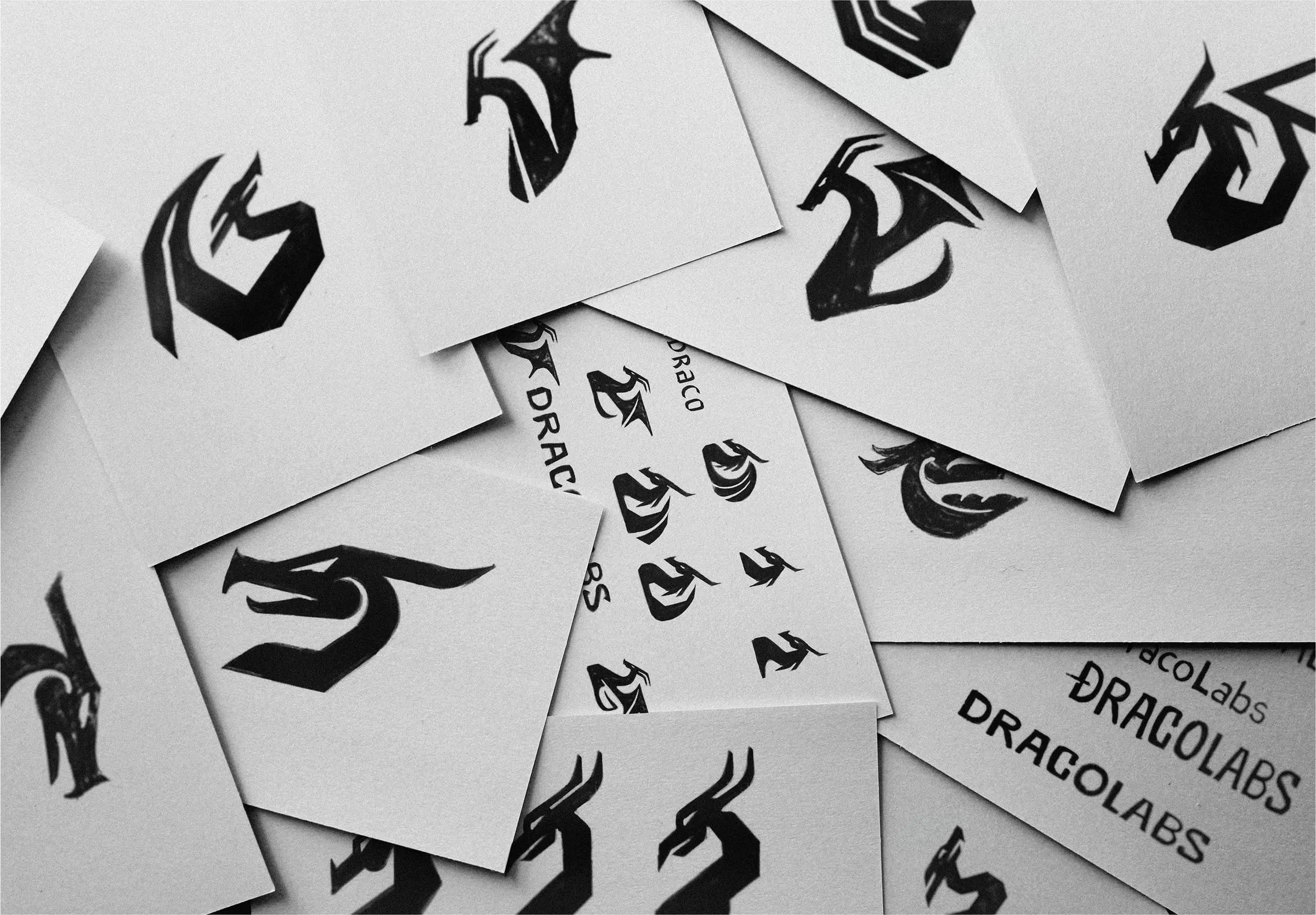
The mark was drawn by hand dozens of times, then rebuilt on a construction grid.